Scarab Chocolate's
Scarab Chocolates

Project Description
For this project we were given an insect that we would make a fake edible product out of that we then created a creative brief for our product. For my insect I had the Sago Palm Weevil and below follows my creative process and how I developed the food product, packaging, the graphic standerd for my company, Scarab Chocolates. My product, Scarab Chocolates, are intended for those who are seeking adventure through their taste buds. As they dive into these rich exotic chocolates, they will get the coconut flavor from the Sago Pal Weevil larvae. Our mission at Scarab Chocolate is that, we believe in offering the finest quality of chocolates combined with the high protein of Sago Palm Weevil Larvae. We combined these insects with chocolate to create a unique experience for your taste buds and to top it off with a gorgeous presentation. We strive as a company to create a product that is eco friendly all around, as we use the palm fibers from the biomass waste form these larvae, to create paper in which we use for all of our packaging, advertising and merchandise.

Logo Variations: The logo is an integral part of the Scarab Chocolate’s brand and should be used thoughtfully and consistently. Most often the logo will be shown with gold fill, as presented to the left but can also be adapted for the use on a background. The logo should most often be displayed with a gold fill.

Business System

Logo Usage
The Scarab Chocolates logo is very symmetrical and clean. By using a center arrangement, it allows versatility. In order to ensure that the logo doesn’t get crowded, the spacing between the logo and the type is set at .5” and in-between the type there is a 15pt space. The word “Scarab” is written in Anders font set at 24pt for and “Chocolate” is written in Manifesto font set at 13pt. the words have a 15pt leading between them.


Th three different typefaces (as shown left to right) are Anders, Manifesto and Gils Sans Light. The Anders typeface (left corner) is used for all headers and the products name on a ll packages. Manifesto typeface (middle) is used for all headers and type when looking for a more classic look. Gil Sans Light typeface (right) is used for all body type. This simple and easy to read type doesn’t distract from colors or experiences of the products packaging.

The letter head will be on a standard 8.5” by 11” paper. The green bar at the top is to emphasis the color of the company. The black and gold pattern at the bottom emphasizes our main pattern on our product. The back pattern to the letterhead emphasis’ our main pattern in the biomimicry that is shown on the inside of our product and adds a hint of gold in the border to tie it all together.

The business card will be 2.5” by 3” card stock with a matte finish on the black and everything else will have a gloss finish. The logo will be centered on both the front and back. The back of the car will be green and have the main pattern in the top right


Website
This is an example of what our website would look like.

Merchandise
Hoodies

Mask

Advertising


Transportation
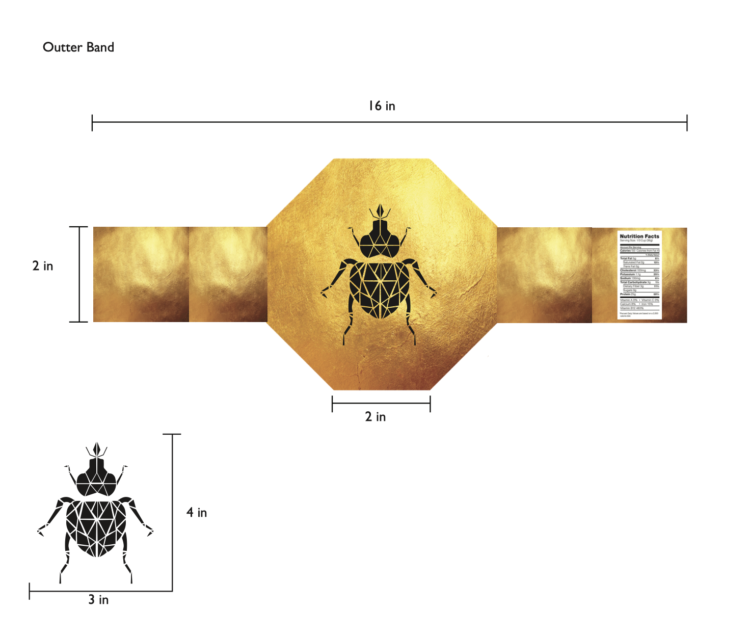
Packaging Flats

Packaging Flat 1/3
Packaging Flat 2/3

Packaging Flat 3/3
Packaging Mockups

Package Mockup
Front

Package Mockup
Back0 with nutrition panel and bar code

Package Mockup
Opened packaging with our mission statement in the inside.
